Custom CSS
Custom CSS helps you to customize the call screen of CometChat which comes with default settings.
- You might want to reposition the calling containers and
- Change the names of participants in the call with different fonts and sizes.
- Change the background color of the call screen or
- Change the height and width of the participants' call screen
You now have access to the custom CSS classes which help you change accordingly to suit your need. Please go through the examples below.
Example
Let's add all the classes that we need to pass inside the calling component in a variable CSS.
- Javascript
- CSS syntax highlighting
let CSS = `
.cc-end-call-icon-container {
background-color: green;
}
.cc-audio-icon-container {
background-color: blue;
}
.cc-video-icon-container {
background-color: blue;
}
.cc-audio-icon-container-muted {
background-color: orange;
}
.cc-video-icon-container-muted {
background-color: orange;
}
.cc-switch-video-icon-container {
background-color: blue;
}
.cc-screen-share-icon-container {
background-color: blue;
}
.cc-main-container {
border: 2px dotted white;
}
.cc-video-container {
border: 2px dotted orange;
}
.cc-bottom-buttons-container {
border: 2px dotted red;
}
.cc-name-label {
border: 2px dotted green;
}
`;
.cc-end-call-icon-container {
  background-color: green;
}
.cc-audio-icon-container {
  background-color: blue;
}
.cc-video-icon-container {
  background-color: blue;
}
.cc-audio-icon-container-muted {
  background-color: orange;
}
.cc-video-icon-container-muted {
  background-color: orange;
}
.cc-switch-video-icon-container {
  background-color: blue;
}
.cc-screen-share-icon-container {
  background-color: blue;
}
.cc-main-container {
  border: 2px dotted white;
}
.cc-video-container {
  border: 2px dotted orange;
}
.cc-bottom-buttons-container {
  border: 2px dotted red;
}
.cc-name-label {
  border: 2px dotted green;
}
You need to pass the CSS string in CallSettings in setCustomCSS.
- Javascript
- Typescript
var callsettings = new CometChatCalls.CallSettingsBuilder()
.setIsAudioOnlyCall(false)
.showEndCallButton(true)
.enableDefaultLayout(true)
.showScreenShareButton(true)
.showMuteAudioButton(true)
.showEndCallButton(true)
.showScreenShareButton(true)
.showPauseVideoButton(true)
.setCustomCSS(CSS). //HERE
.build();
| Property | Description | Type | Value |
|---|---|---|---|
| setCustomCSS | Option to update the custom css for call screen | String | CSS |
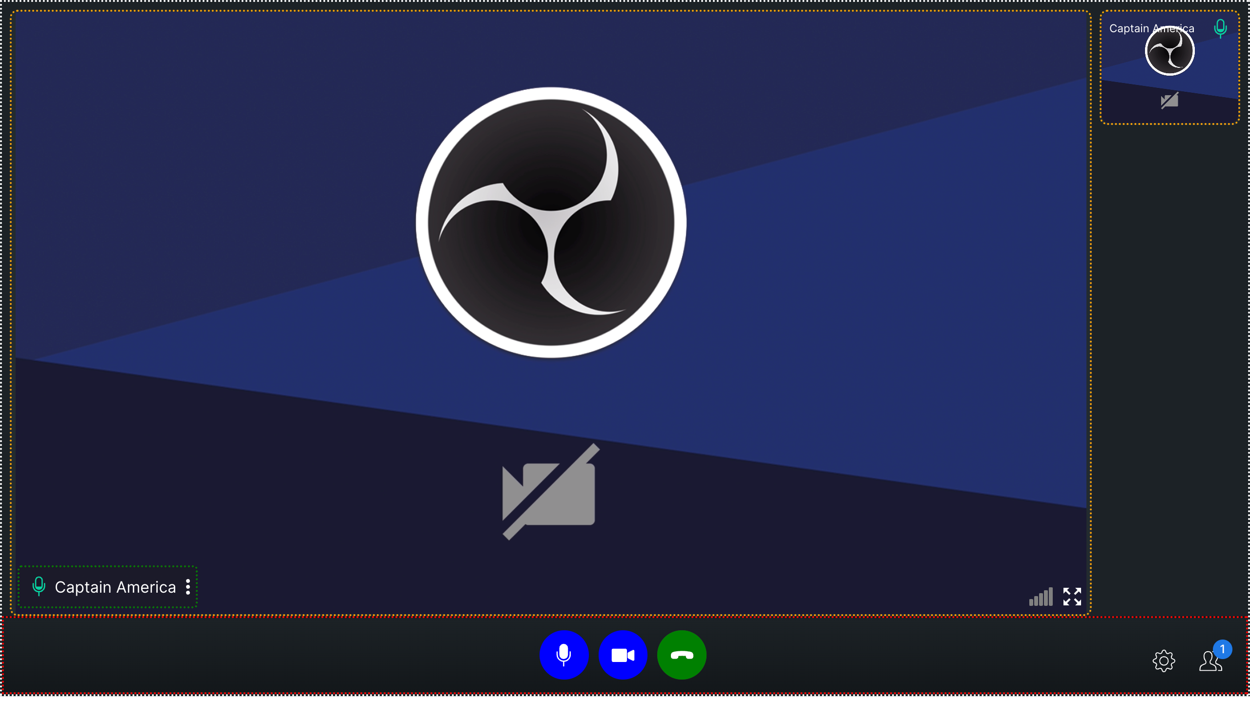
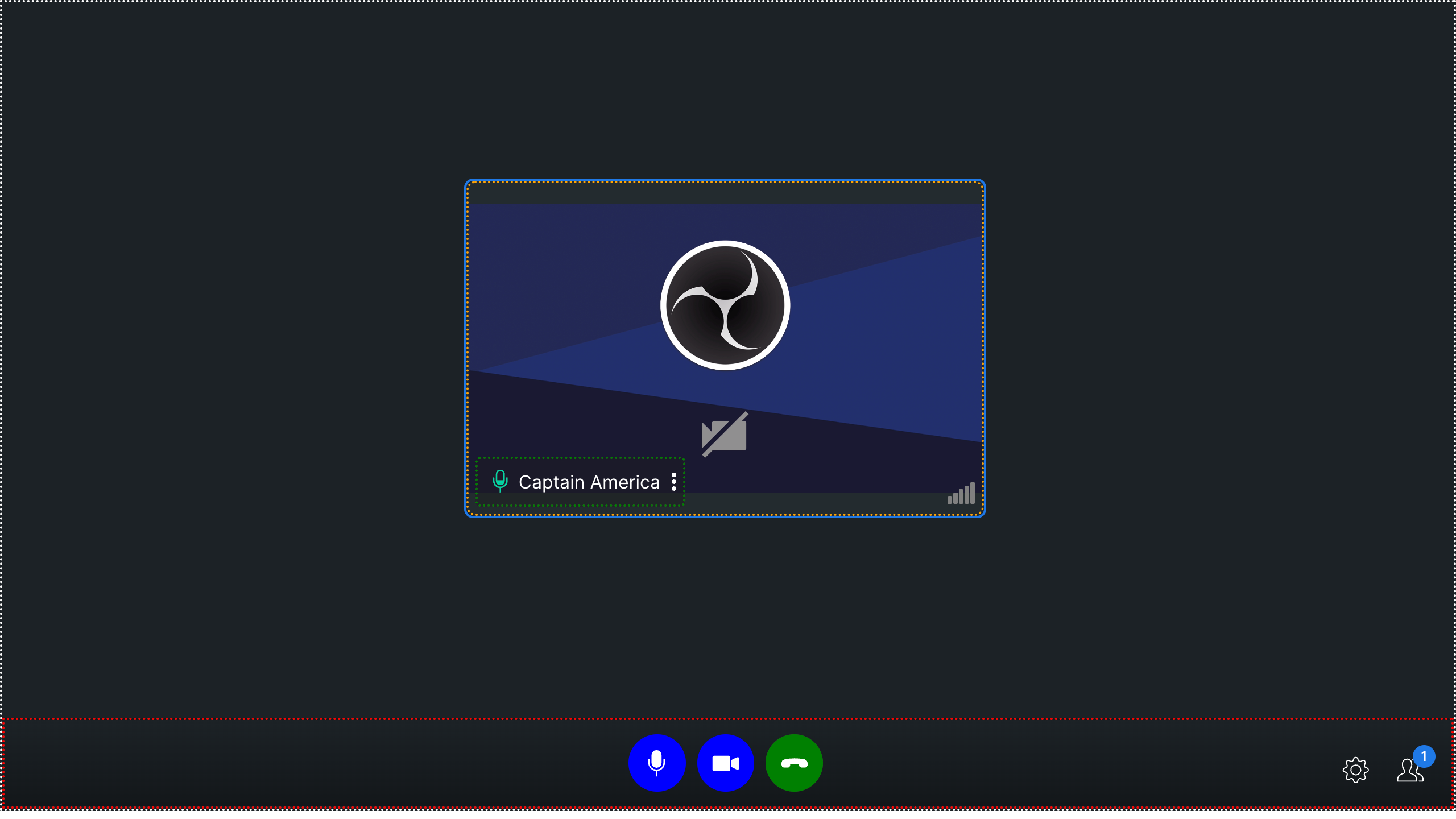
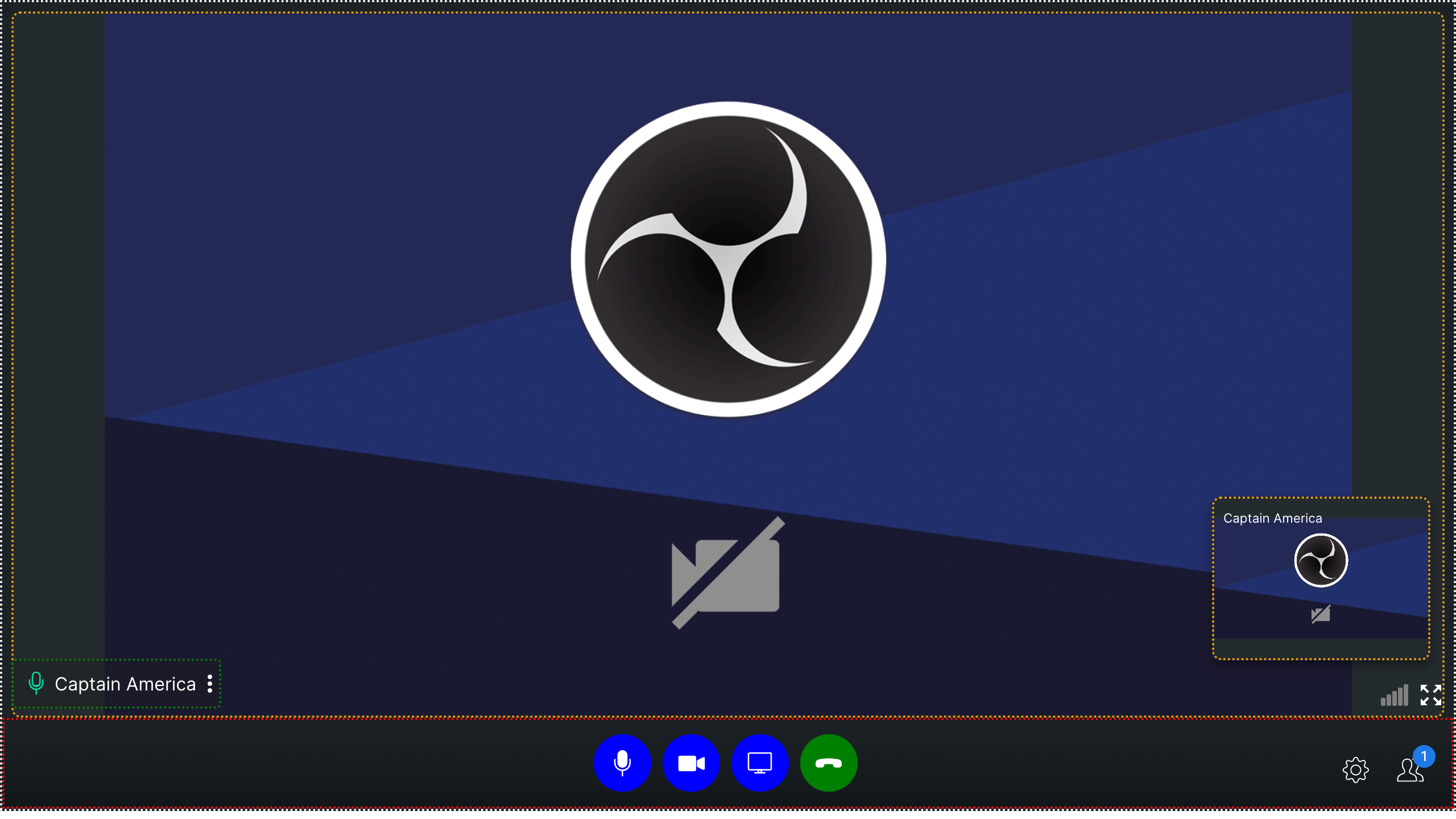
The above example results in the below output:-
Mode: DEFAULT

Mode: TILE

Mode: SPOTLIGHT

Common CSS Classes
There are a few common classes used for different modes in the call screen
- cc-main-container
The outermost component of the calling component is represented by a white border in the screenshots above, indicating that it acts as a container for other components.
- cc-bottom-buttons-container
The container located at the very bottom of the interface houses various action buttons, such as the mute/unmute audio and video, end call, settings icon, and participants icon, among others. It is represented by the red border in above screenshot.
- cc-name-label
This class is passed in user name text container in all modes. It is represented by green border in the above screenshots.
- cc-video-container
This class is passed to the video container in all modes. It is represented by orange border in the above screenshots.
Bottom Buttons
- cc-bottom-buttons-container - This is the container of all the buttons in calling.
- cc-bottom-buttons-icon-container This is the div of every button in the button bar.
Individual bottom buttons CSS classes
cc-audio-icon-containercc-audio-icon-container-mutedcc-video-icon-containercc-video-icon-container-mutedcc-screen-share-icon-containercc-switch-video-icon-containercc-end-call-icon-container
It is recommended to not pass CSS of other classes which are not listed here as it may cause some UI issues. Also resizing of the grid container is not allowed as it may affect the layout of grid mode.