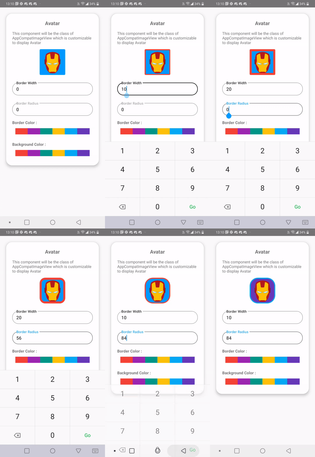
Avatar
CometChatAvatar component displays an image or user's avatar with fallback to the first two letters of the username or group's icon with fallback to the first two letter of the group name.

How to integrate CometChatAvatar ?
CometChatAvataris an stateless widget that can be added directly to your build method
- Dart
CometChatAvatar(
  image: "<image_url>", // Replace it with asset image url
  name: "<name>" // Replace it with name
);
Properties
| Properties | Type | Description |
|---|---|---|
| image | String | image will be obtained from path from assets. if name and image both are passed image will be visible |
| name | String | used to can specify name to be shown in avatar (initials only), if image is not available |
| style | AvatarStyle | used to customize appearance of the Avatar |
AvatarStyle
| Properties | Type | Description |
|---|---|---|
| height | double | used to set height |
| width | double | used to set width |
| border | BoxBorder | used to set border of the inner circle |
| background | Color | used to set background color |
| gradient | Gradient | used to set a gradient background |
| borderRadius | double | used to modify the corner radius of inner circle |
| outerBorderRadius | double | used to modify the corner radius of outer circle |
| outerViewBorder | BoxBorder | used to modify the border of outer circle |
| outerViewWidth | double | used to modify the border width of outer circle |
| outerViewBackgroundColor | Color | used to modify the background color of outer circle |
| outerViewSpacing | double | used to modify spacing between the image and the outer border |
| nameTextStyle | TextStyle | used to modify the text style for name if image is not available |
Usage
- Dart
CometChatAvatar(
  image: "https://data-us.cometchat.io/assets/images/avatars/spiderman.png",
  name: "Spidey",
  style: AvatarStyle(
    width:  36,
    height:  36,
    background: Colors.blue,
    borderRadius: 16,
    outerBorderRadius: 16,
    border: Border.all(
      color: Colors.amber,
      width: 1,
    ),
    outerViewBackgroundColor: Colors.teal,
    nameTextStyle: TextStyle(fontSize: 20),
    outerViewBorder: Border.all(
      color: Colors.pink,
      width: 1,
    ),
    outerViewSpacing: 2,
    outerViewWidth: null,
  )
);